标志设计与VI设计
中国建银投资集团公司是一家经国务院批准成立的国有投资公司,成立于2004年9月,注册资本206.9225亿元。经营范围为:投资与投资管理;资产管理与处置;企业管理;房地产;咨询。标志反映的核心思想与使命感:
《易》说:“日月得天而久照,四时变化而久成”,中国建投将在规则中寻求变化,发展中寻求永恒,秉承对当代投资理念的深刻理解,恪守法则,勤业创新,实践中国投资的稳健发展。
标志体现的企业及行业特质:
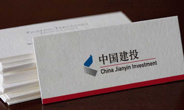
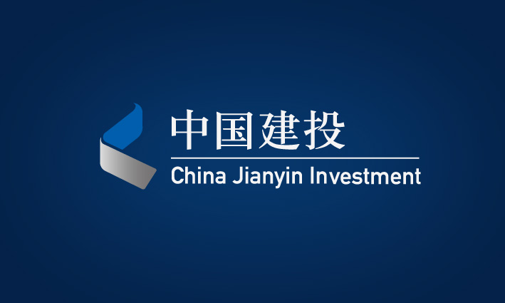
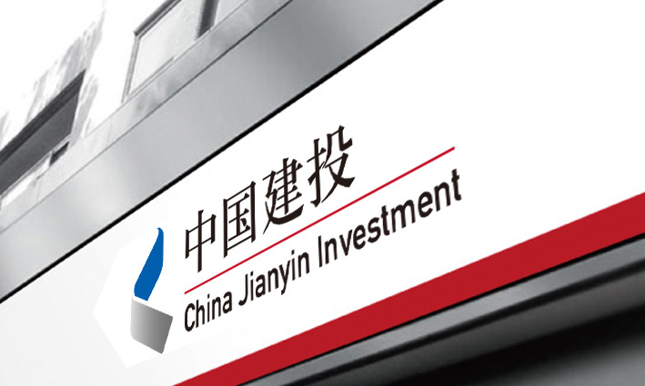
标志由蓝灰两部分构成,蓝色部分代表中国建投睿智、务实、精准、包容的企业诉求,灰色部分代表中国建投稳健务实,持续发展的行业诉求。图形拔地而起,仿佛中国的象征——长城的剪影,又表现了中国建投在中国资本市场上拾阶而上,打造行业标杆的不懈追求。
标志的造型与色彩:
标志造型可以看做是一个折叠的开始,万象衍生于太极,象征中国建投以无穷的创造力投入到中国投资业的发展变革之中。
标志的结构分上下两部分,下部稳固坚定,象征中国建投的稳健作风和坚实基础;上部飘逸上扬,象征中国建投的创新意识及蓬勃向上的生机。
标志的上下部分呈现渐变的蓝灰两色,灰色部分寓意成熟,象征传统与积淀;蓝色部分寓意希望,象征现代与包容。两种颜色有机结合,展现了中国建投立足于优秀传统文化和投资理念,厚积薄发,不断提升的发展趋势。
标志整体造型与色彩配合,一引一顿,若中国书法,又如卷涌水势,造型灰色调最重处嘎然收笔,彰显气势与力度;流动与汇集的水势,象征公司源开八方,财聚鼎盛。
标准字组合图形意义:
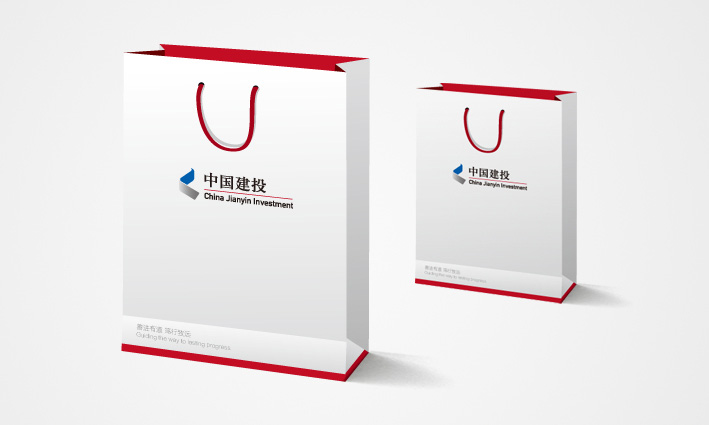
新标志,将标准字的中英文用一条红线相隔,红色象征活力与进取的精神;代表了中国建投以新的时代精神,锐意进取,开拓美好未来之意。直线,具有无限延伸之感,无远弗届,寓意企业的顺畅之路,无限发展的空间。
China Jianyin Investment Limited is a state-owned investment company, approved by the State Council, founded in 2004 September, registered capital of 20692250000 yuan. Scope of business: investment and investment management; asset management and disposal; enterprise management; real estate; consultation. Marks the core thought and reflects the sense of mission:
"Easy" said: "the sun and the moon day and long illumination, change long into" four, Chinese will be built to seek changes in the rules, seek the eternal development, adhering to a deep understanding of contemporary investment idea, comply with the rules, industry innovation, steady development Chinese investment practice.
Symbol of the enterprise and industry embodies qualities:
Marked by the blue gray in two parts, blue on behalf of the Chinese built for wisdom, practical, accurate and inclusive enterprise appeal, gray indicates China voted to build robust and pragmatic, industry demands of sustainable development. Figure after another, as if China symbol -- the Great Wall silhouette, but also the performance of the Chinese construction investment in China capital market and pick up order, the relentless pursuit of creating the industry benchmarking.
Shape and color mark:
The logo can be seen as a folding initiation, Vientiane derived from Tai Chi Symbol, China Jianyin Investment Limitedto the infinite creativity into the development of transformation to a China investment industry in.
The structure symbol upper and lower two parts, the lower part of steady, steady style symbol and a solid foundation China Jianyin Investment Limited; the upper elegant rose, a symbol of the innovation consciousness and the vigorous China voted to build the vitality.
The upper part and the lower part logo has a gradient of grey and blue and white, gray part of moral maturity, a traditional symbol and accumulation; blue symbolizes hope, a symbol of modern and inclusive. Two kinds of color combination, shows the China Jianyin Investment Limited based on excellent traditional culture and the investment philosophy, knowledge, the development trend of rising.


标志设计与VI设计
中国建银投资集团公司是一家经国务院批准成立的国有投资公司,成立于2004年9月,注册资本206.9225亿元。经营范围为:投资与投资管理;资产管理与处置;企业管理;房地产;咨询。标志反映的核心思想与使命感:
《易》说:“日月得天而久照,四时变化而久成”,中国建投将在规则中寻求变化,发展中寻求永恒,秉承对当代投资理念的深刻理解,恪守法则,勤业创新,实践中国投资的稳健发展。
标志体现的企业及行业特质:
标志由蓝灰两部分构成,蓝色部分代表中国建投睿智、务实、精准、包容的企业诉求,灰色部分代表中国建投稳健务实,持续发展的行业诉求。图形拔地而起,仿佛中国的象征——长城的剪影,又表现了中国建投在中国资本市场上拾阶而上,打造行业标杆的不懈追求。
标志的造型与色彩:
标志造型可以看做是一个折叠的开始,万象衍生于太极,象征中国建投以无穷的创造力投入到中国投资业的发展变革之中。
标志的结构分上下两部分,下部稳固坚定,象征中国建投的稳健作风和坚实基础;上部飘逸上扬,象征中国建投的创新意识及蓬勃向上的生机。
标志的上下部分呈现渐变的蓝灰两色,灰色部分寓意成熟,象征传统与积淀;蓝色部分寓意希望,象征现代与包容。两种颜色有机结合,展现了中国建投立足于优秀传统文化和投资理念,厚积薄发,不断提升的发展趋势。
标志整体造型与色彩配合,一引一顿,若中国书法,又如卷涌水势,造型灰色调最重处嘎然收笔,彰显气势与力度;流动与汇集的水势,象征公司源开八方,财聚鼎盛。
标准字组合图形意义:
新标志,将标准字的中英文用一条红线相隔,红色象征活力与进取的精神;代表了中国建投以新的时代精神,锐意进取,开拓美好未来之意。直线,具有无限延伸之感,无远弗届,寓意企业的顺畅之路,无限发展的空间。


China Jianyin Investment Limited is a state-owned investment company, approved by the State Council, founded in 2004 September, registered capital of 20692250000 yuan. Scope of business: investment and investment management; asset management and disposal; enterprise management; real estate; consultation. Marks the core thought and reflects the sense of mission:
"Easy" said: "the sun and the moon day and long illumination, change long into" four, Chinese will be built to seek changes in the rules, seek the eternal development, adhering to a deep understanding of contemporary investment idea, comply with the rules, industry innovation, steady development Chinese investment practice.
Symbol of the enterprise and industry embodies qualities:
Marked by the blue gray in two parts, blue on behalf of the Chinese built for wisdom, practical, accurate and inclusive enterprise appeal, gray indicates China voted to build robust and pragmatic, industry demands of sustainable development. Figure after another, as if China symbol -- the Great Wall silhouette, but also the performance of the Chinese construction investment in China capital market and pick up order, the relentless pursuit of creating the industry benchmarking.
Shape and color mark:
The logo can be seen as a folding initiation, Vientiane derived from Tai Chi Symbol, China Jianyin Investment Limitedto the infinite creativity into the development of transformation to a China investment industry in.
The structure symbol upper and lower two parts, the lower part of steady, steady style symbol and a solid foundation China Jianyin Investment Limited; the upper elegant rose, a symbol of the innovation consciousness and the vigorous China voted to build the vitality.
The upper part and the lower part logo has a gradient of grey and blue and white, gray part of moral maturity, a traditional symbol and accumulation; blue symbolizes hope, a symbol of modern and inclusive. Two kinds of color combination, shows the China Jianyin Investment Limited based on excellent traditional culture and the investment philosophy, knowledge, the development trend of rising.

