标志设计理念
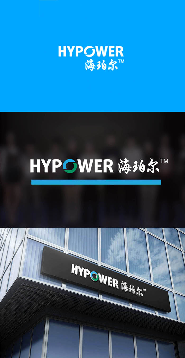
标志采用英文的表现形式,彰显全球性和广泛性,企业的品牌价值由此得到体现。将O字形重点突出,形成循环之意,寓意清洁能源,以此来说明企业的文化与事业。而在图形上给予品牌最鲜活的注解蓝色代表蓝天,绿色代表了绿地。蓝绿色的色调让人想到森林并且产生对绿色美好环境的向往,代表自然、健康、积极向上,从而激发人们对大自然的爱对氢能的迫切需求。此图案巧妙之处在于对负空间的高度利用形成了逗号的造型,给受众无限循环源源不断的视觉感受,寓意科技永无止境整幅画面让人体会到永不停息的动感也表示公司永远充满活力、上下团结一心。这个logo的设计还融入了地球磁场知识、风水文化、地球动力学、相对论等方面的东西,可谓是包罗万象。此标志不仅是国际设计风格,亦是当代企业的时代风范展示,以简洁明了的图文结合的方式与社会大众沟通,使企业信息得以快速传播并形成品牌信息的文化沉淀。
The logo uses the English expression form, manifests the globality and the universality, the enterprise brand value thus obtains manifests. Focus on the O-shaped, form the meaning of recycling, imply clean energy, in order to illustrate the enterprise's culture and career. On the graph, the most vivid annotation of the brand is the blue sky, and the green represents the green space. The blue-green hue reminds people of the forest and gives rise to the yearning for a beautiful green environment, representing nature, health, positive, thus stimulating people's love for nature and the urgent need for hydrogen energy. The cleverness of this design lies in the high use of negative space to form a comma shape, giving the audience endless cycle of visual experience, implying that technology never ceases to let the whole picture to experience the never-ending dynamic also shows that the company is always full of vitality, unity. The logo also incorporates knowledge of the Earth's magnetic field, geohydrology, geodynamics, relativity and other aspects of things, can be said to be all-inclusive. This logo is not only an international design style, but also a demonstration of contemporary enterprise's style of the times. It communicates with the public in a concise and clear way, so that enterprise information can be quickly disseminated and form a cultural precipitation of brand information.