中国诺尔集团(山东)
品牌设计与VI设计
中国诺尔集团(NOEL Group)位于驰名中外的泰山脚下—--山东省泰安市长城路时代明珠商务大厦16层,是一家集研发、生产、销售于一体的大型企业集团。集团主要涉及塑料、仪器仪表、仓储物流3大行业。
传大优浦设计公司负责了中国诺尔集团的集团标志与分公司标志设计。
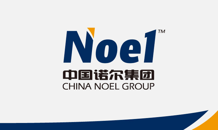
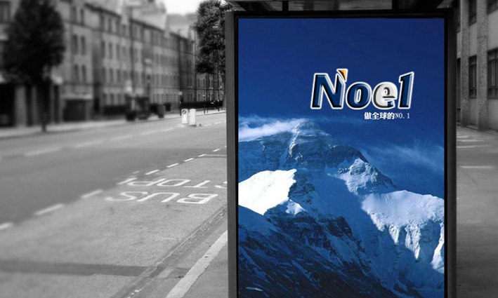
标志以诺尔的英文Noel为创意出发点,用英文标识的特点就是简约,大气,通过简单的字符,体现出企业的理念与服务精神,在这里,Noel体现出企业标志里所蕴含的NO.1的追求目标与服务目标。字母中间的e,在这里赋予了企业在e时代的进取精神,体现了企业与时俱进的时代精神风貌。在造型设计上,此标志的英文字首字母N的末端,由一个蓄势腾飞的橙色箭头,箭头蓄势待发,充满了运动的张力,能形象的代表了企业在新世纪的快速发展,同时箭头也代表了科技的力量。标志字体饱满,颜色稳重,深蓝色具有睿智与科技色彩,橙色具有亲和力与热情之感,代表了企业踏实做事,谦虚为人的精神。
China Noor Group (NOEL Group) is located in the foot --- the world-famous Mount Tai, Shandong Province, Tai'an City, the Great Wall Road, Pearl age 16-story commercial building, is a research and development, production and sales of large enterprise groups. The Group is principally involved in plastics, instrumentation, storage and logistics three big business.Chuan-Pu design company responsible for large U Knoll Group, a group of China's flag and branch logo design. Noel Noel in English logo is the starting point for creative, English identity is characterized by simple, the atmosphere, through a simple character, reflecting the spirit of enterprise and service concepts, where, Noel reflect the corporate logo inside NO.1 implied in the the pursuit of objectives and performance targets. The middle letter e, where e gives enterprises in the era of the enterprising spirit of advancing with the times reflects the enterprise spirit.In product design, this marks the first letter N at the end, poised to take off from an orange arrow, arrow poised to take off, full of tension in the movement, can represent the image of enterprises in the new century, the rapid development of At the same time the arrows also represents the power of technology.Logo Fonts full, color stable, dark blue with the wisdom and technology, color, orange with a sense of affinity and passion on behalf of the enterprise practical work, modest man's spirit.


中国诺尔集团(山东)
品牌设计与VI设计
中国诺尔集团(NOEL Group)位于驰名中外的泰山脚下—--山东省泰安市长城路时代明珠商务大厦16层,是一家集研发、生产、销售于一体的大型企业集团。集团主要涉及塑料、仪器仪表、仓储物流3大行业。
传大优浦设计公司负责了中国诺尔集团的集团标志与分公司标志设计。
标志以诺尔的英文Noel为创意出发点,用英文标识的特点就是简约,大气,通过简单的字符,体现出企业的理念与服务精神,在这里,Noel体现出企业标志里所蕴含的NO.1的追求目标与服务目标。字母中间的e,在这里赋予了企业在e时代的进取精神,体现了企业与时俱进的时代精神风貌。在造型设计上,此标志的英文字首字母N的末端,由一个蓄势腾飞的橙色箭头,箭头蓄势待发,充满了运动的张力,能形象的代表了企业在新世纪的快速发展,同时箭头也代表了科技的力量。标志字体饱满,颜色稳重,深蓝色具有睿智与科技色彩,橙色具有亲和力与热情之感,代表了企业踏实做事,谦虚为人的精神。


China Noor Group (NOEL Group) is located in the foot --- the world-famous Mount Tai, Shandong Province, Tai'an City, the Great Wall Road, Pearl age 16-story commercial building, is a research and development, production and sales of large enterprise groups. The Group is principally involved in plastics, instrumentation, storage and logistics three big business.Chuan-Pu design company responsible for large U Knoll Group, a group of China's flag and branch logo design. Noel Noel in English logo is the starting point for creative, English identity is characterized by simple, the atmosphere, through a simple character, reflecting the spirit of enterprise and service concepts, where, Noel reflect the corporate logo inside NO.1 implied in the the pursuit of objectives and performance targets. The middle letter e, where e gives enterprises in the era of the enterprising spirit of advancing with the times reflects the enterprise spirit.In product design, this marks the first letter N at the end, poised to take off from an orange arrow, arrow poised to take off, full of tension in the movement, can represent the image of enterprises in the new century, the rapid development of At the same time the arrows also represents the power of technology.Logo Fonts full, color stable, dark blue with the wisdom and technology, color, orange with a sense of affinity and passion on behalf of the enterprise practical work, modest man's spirit.
