标志设计
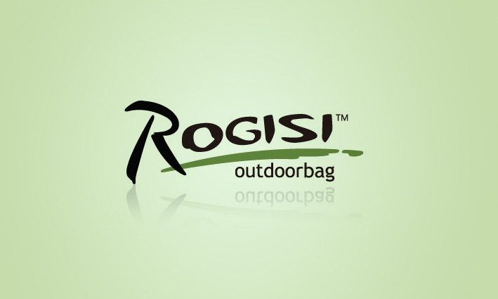
路杰士的品牌标志风格以简洁,字母为主。因为这样 在标志的延展与宣传过程中才可以表达的清晰。 标志以陆杰士的英文字母为创作原点,字母采用人工手写的造型,随意洒脱,代表了路杰士品牌的休闲,军旅之感,大气不失活泼。 标志底部分的弧线绿草地,采用毛笔飞白的造型,一气呵成,简洁自然,代表了旅行的特点,亲近自然之感。同时也是路杰士的品牌成长轨迹。标志如同行走在草地上,动感与形象结合。大气与休闲并存。传大优浦VI设计部负责了此次电影的影片标志设计与相关宣传设计工作。
Rogisi brand logo style with simple, the main characters. Because of this in the sign extension and promotion process can express clearly. Signs in the land of letters for the creation of English Klipsch origin, using artificial handwritten letter shape, free free and easy, on behalf of the Rojas brand of leisure, the military sense, the atmosphere lively. The green part of the symbol of arc bottom, using brush calligraphy style, make smooth reading, simple and natural, represents the characteristics of travel, close to natural feeling. At the same time the brand growth trajectory is the road to jieshi. Signs like walking on the grass, and the combination of dynamic image. The atmosphere and leisure coexist. Creatup excellent VI design department is responsible for the films logo design and related publicity design.
