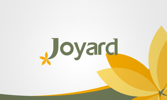
标志设计与VI设计
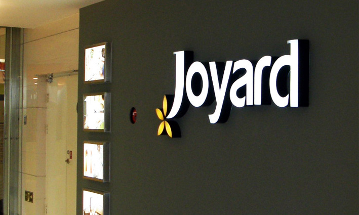
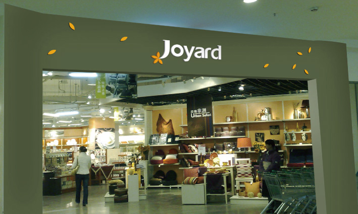
卓雅品牌灵感源于“Joy Yard”——一个快乐生活的代名词 Joyard产品甄选自全球各地,集萃中国大陆及台湾、日本、韩国、欧美、东南亚等国家和地区的家居生活用品之精华。作为高档生活家品的卖场—卓雅家品标志VI设计,对于传大优浦来说是一个挑战,面对众多的竞争品牌如特力屋,宜家家居,伊利诺伊等,如何在品牌标志方面有所创新,是摆在传大优浦面前的难题,在设计了众多的品牌标志之后,这款标志被客户认可,没有进行丝毫的修改。
标志释义: 1、标志采用非常简洁现代的字体表现出卓雅家品的国际化风格和时尚品味; 2、J用加粗的笔触特别突出,显示出joy享受家居生活的快乐心情,个性独特; 3、J左下角的黄色小花显示出卓雅家品的精致和热情; 4、标志的色调突出了高品位和世界感。
JOYARD brand inspiration comes from "Joy Yard" -- a happy life synonymous with Joyard product selection from all over the world, the collection of China mainland and Taiwan, Japan, Korea, Europe and America, Southeast Asia and other countries and regions Home Furnishing essence of life activities. As a high-grade life home goods stores - Zhuo Yajia product logo design VI, for Creatup excellent is a challenge, in the face of numerous competing brands such as HOLA, IKEA Home Furnishing, Illinois, how to innovate brand mark, is a problem placed in front of Creatup excellent, after the design of many brand logo, the logo has been recognized by customers, without the slightest modification.
Logo meaning: signs 1, using very simple modern font show Zhuo Yajia goods international style and fashion taste; 2, J with bold strokes particularly prominent, showing that joy enjoy Home Furnishing life happy mood, unique personality; 3, the bottom left corner of the J small yellow flowers show Zhuo Yajia product sophistication and enthusiasm; 4, mark color highlights the high grade and the sense of the world.
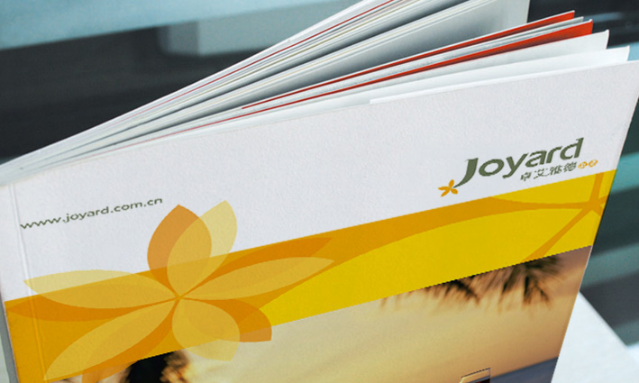
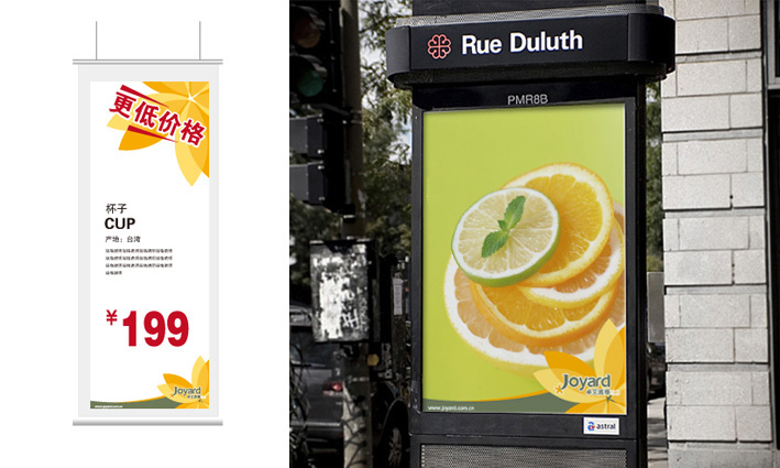
Gradient colors, different colors, used in different items, that is, the overall unity and different forms, with changeless should. Also reflects the enterprising spirit of enterprise.
