标志设计与VI设计
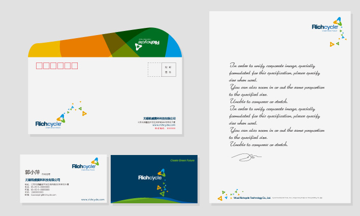
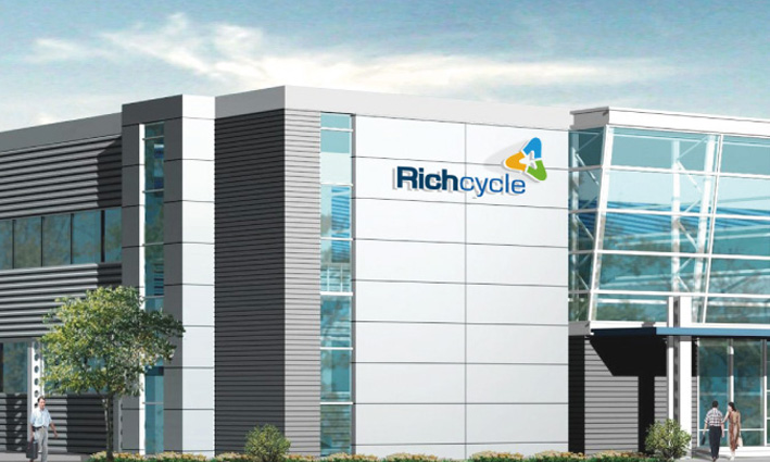
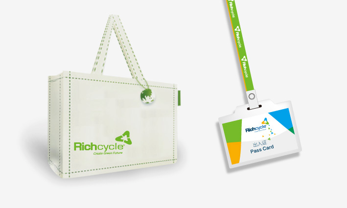
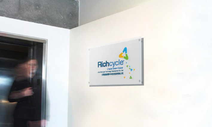
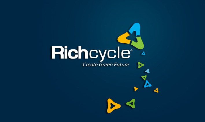
无锡Richcycle节能环保公司是一家合资企业。专注于节能与环保领域。其公司委托传大优浦品牌设计公司对其进行品牌形象与VI设计。标志以Richcycle的英文配合图形为切入点,主要是彰显国际化,大气的风格。标志图案中,三个字母C,同时也是汉字”人“的造型,组成了具有环保标志的造型,其反白图形,形成了一颗大树的造型,代表了人人参与,联手参与节能环保的概念。同时,也预示着企业的多元发展态势。标志的颜色,选用黄色,绿色,蓝色,黄色代表了大众,绿色代表了大地,蓝色代表了天空,于是,天地人之间的和谐统一,在这里一一体现出来。只有人人参与环保,才能创造美好的未来。
Wuxi Richcycle energy saving and environmental protection Co. is a joint venture. Focus on energy-saving and environmental protection. The company commissioned Creatup excellent brand design company brand image and design of VI on it. The logo in the English with Richcycle graphics as the breakthrough point, mainly is to reveal the internationalization, the atmospheric style. Logo, three letters of C, is also Chinese characters "people" shape, form with environmental protection logo shape, its white pattern, forming a tree shape, on behalf of everyone involved in the concept of energy saving and environmental protection, to participate in the. At the same time, also indicates that the diversified development of state enterprises. The marker color selection of yellow, green, blue, yellow, on behalf of the public, green represents the earth, blue represents the sky, so, the harmonious unification between the one one reflected in the world, out here. Only if everyone involved in environmental protection, in order to create a better future.
